-
Access the Platform
Log in to your IDXAddons account
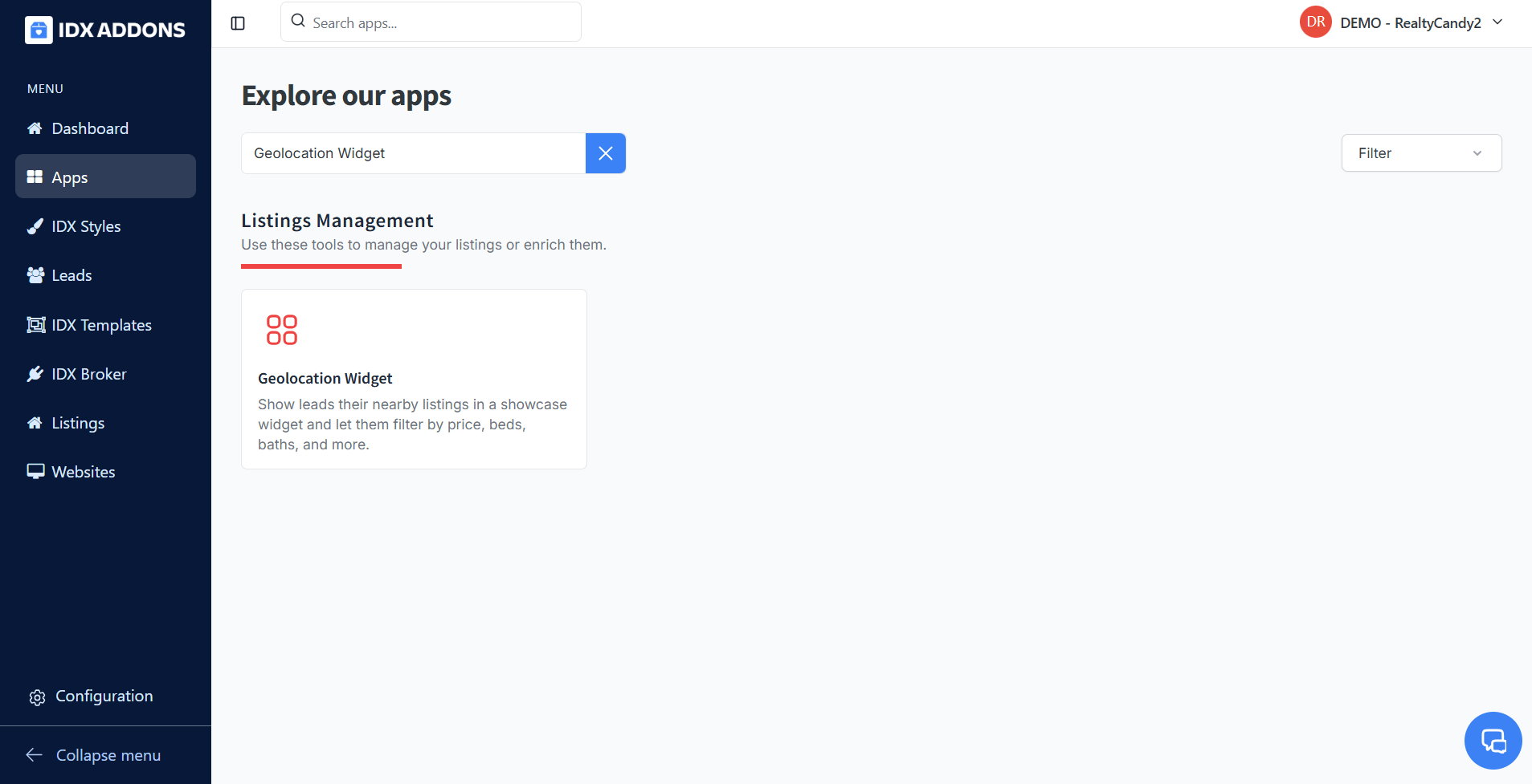
In the dashboard, select the Geolocation Widget app.
-
Select the default settings
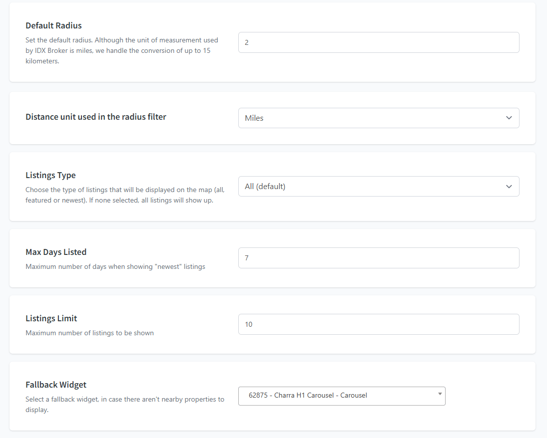
When you enter the app you have the setup tab, the first thing to do is to select the default configuration.
- Default radius: The default radius distance to display properties.
- Distance unit: This widget contains an option to filter by distance. You can choose between miles or kilometers. Although the unit of measurement used by IDX Broker is miles, we handle the conversion of up to 15 kilometers.
- Listings Type: Choose the type of listings that will be displayed on the map (all, featured or newest). If none selected, all listings will show up.
- Max Days Listed: Maximum number of days when showing "newest" listings.
- Listings Limit: Maximum number of listings to be shown.
- Fallback Widget: Select a fallback widget, in case there aren't nearby properties to display.
-
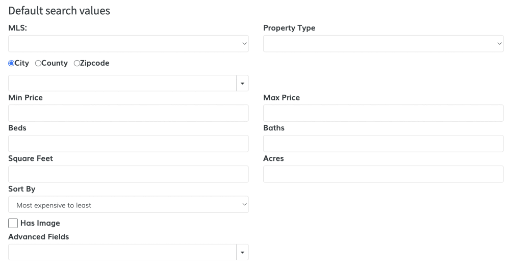
Select the advanced settings (optional)
You can set some default listings for the listings that will be displayed, like the price, the sort order (eg Newest Listings), or even add an advanced field to only display properties with pool.
-
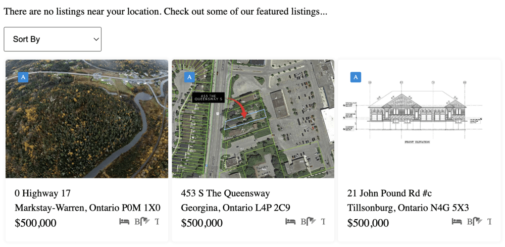
Choose a Fallback Widget
Select one of your IDX Broker Legacy Widgets. It will be displayed if the leads doesn't allow location access.

Leverage this feature to highlight the newest or your exclusive listings.
-
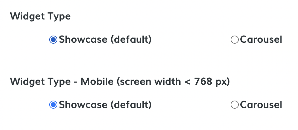
Select the widget type for desktop and mobile
You can choose between a showcase or a carousel widget to display on desktop and mobile. For example, you could display the carousel version of this widget on desktop and the showcase version on mobile.
-
Set a widget theme (optional)
You can add a theme to your widget. You can showcase some examples here.
For this example, we will choose the "Houses 15" theme:
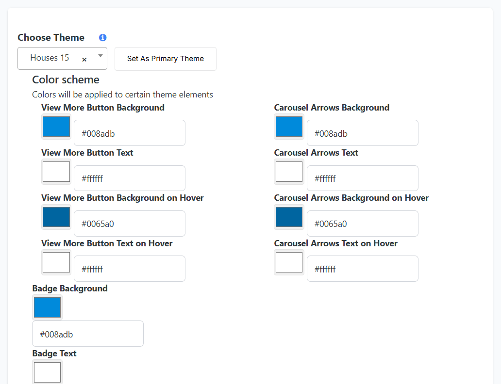
After selecting the theme, click on "Show color scheme" to display the available options. You can set the different colors, according to the selected theme. Notice that only some colors will be applied to certain elements, depending on the selected theme. Once you're happy with your selection, click on "Save Color Scheme".
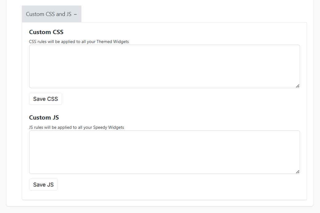
Next, you have the Custom CSS & JS option. Clicking on it will reveal two sections:
- Custom CSS: CSS rules will be applied to all your Themed Widgets.
- Custom JS: JS rules will be applied to all your Speedy Widgets.
After entering the required information, click the "Save CSS" or "Save JS" button to save your changes.
 Set a primary theme
If you want to use only one theme (recommended), just select the theme and click on "Set As Primary Theme".

When you select the Primary Theme, you will see this message. You can always change the default theme later.
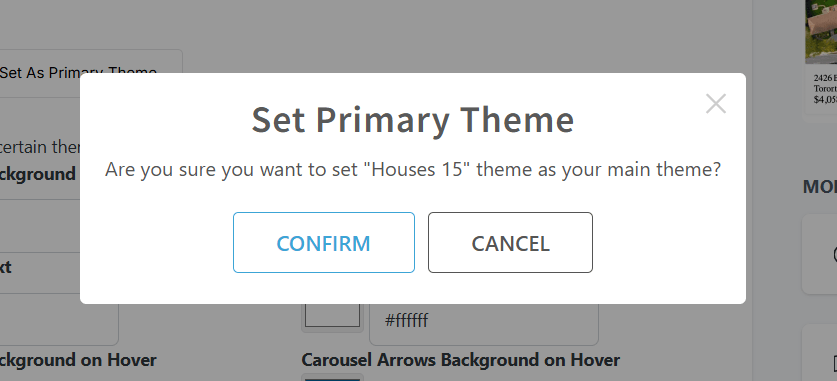
Note that changing the Default theme will not change the theme your website widgets are already using. setting is used only for making it easy for you to find the theme you used before.

-
Copy code
Once you've made your selection, click on the Copy Code button and it will be copied to your clipboard.

-
How does it look?
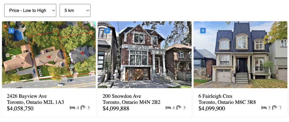
When you add the Geolocation Widget, your clients can see listings like the following:
