-
Access the Platform
Log in to your IDXAddons platform account
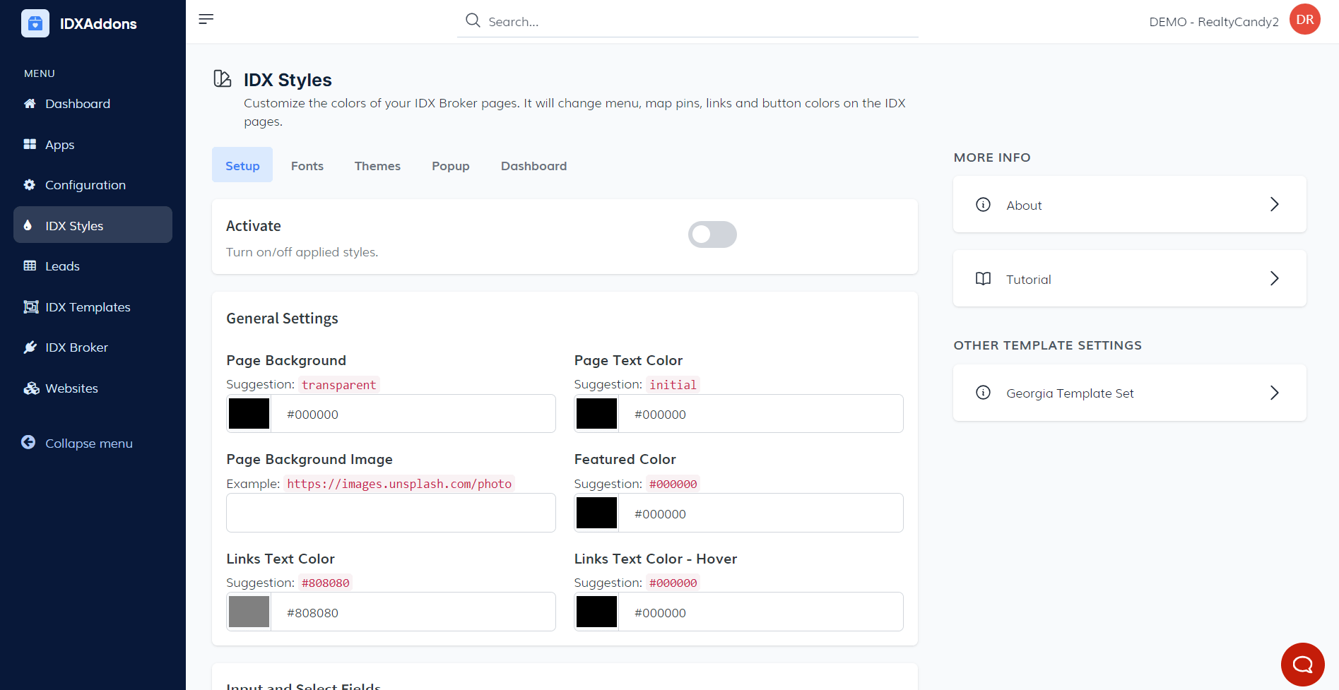
In the left menu, select the IDX Styles option.
-
Setup Tab Overview
In the Setup tab, you'll find several key options to customize the design and appearance of your IDX Pages.
Design Activation Toggle Button At the top, you'll see a toggle button that allows you to enable or disable the applied designs for IDX Pages. This gives you flexibility to switch between default and customized designs with ease.
General Settings Below the toggle, you'll find the General Settings section. Here, you can configure various elements of the page's design, such as:
- Page Background: Set the background color for the entire page.
- Page Text Color: Choose the color for the text on the page.
- Featured Color: Customize the featured color used across your site.
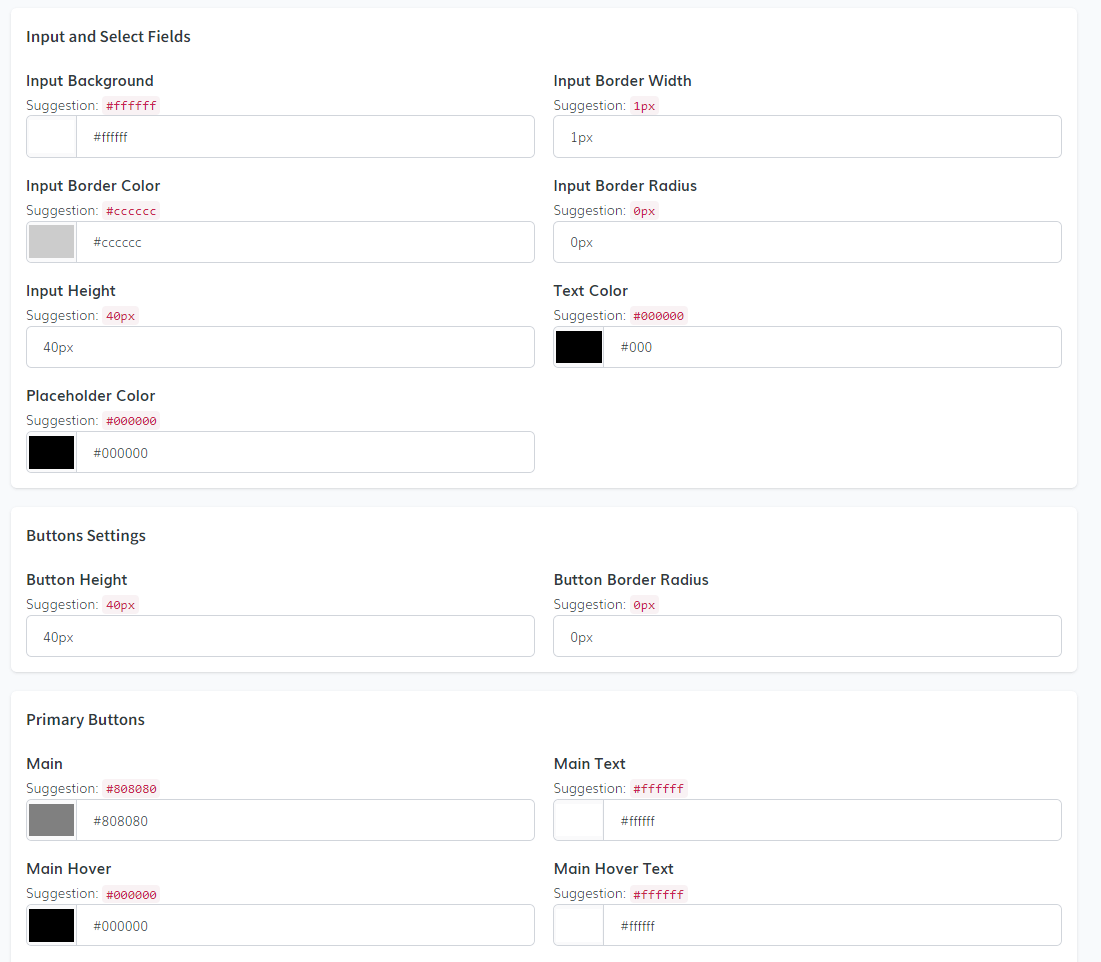
- Input and Select Fields: Adjust the appearance of form input fields and dropdown menus.
- Button Settings: Personalize button styles, including primary buttons and other elements across the page.
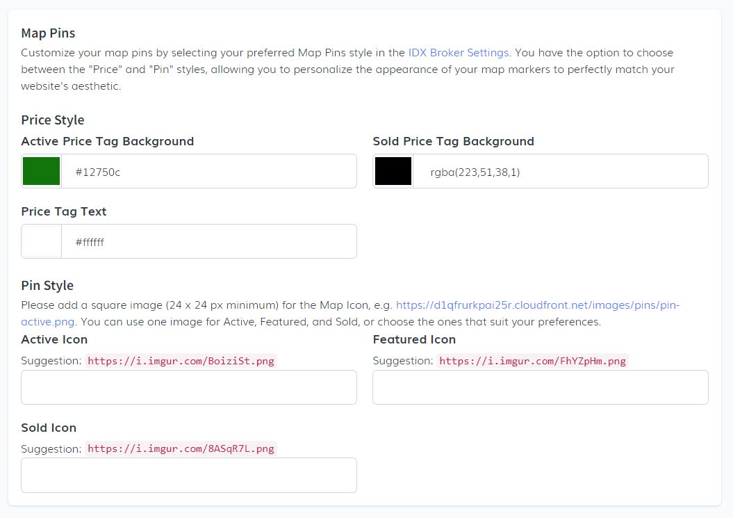
In the Map Pins section of the IDX Broker Settings, you can personalize your map markers to match your website's aesthetic. You have two styles to choose from:
- Price Style: Customize the background color for active price tags, set a different background color for sold price tags and choose a color for the price tag text.
- Pin Style: Upload a square image (minimum 24 x 24 px) for the Map Icon. You can use a single image for Active, Featured, and Sold states, or select different images for each. Suggested images can be found online or customized as per your preference.
Code Snippet: In this final step of the Setup section, it's important to note that the necessary code snippet for this app is already embedded within our IDX Templates. This means you don't need to manually add the code to the IDX Broker Sub-Headers.
-
Fonts Customization
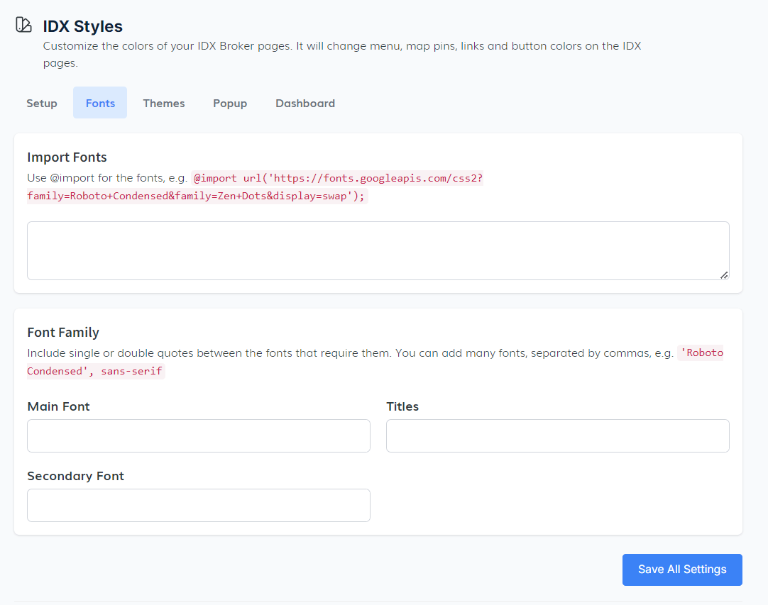
In the Fonts tab, you have the ability to customize the typography for your IDX pages by importing and setting the fonts that best suit your design.
- Import Fonts: You can use the @import rule to import external fonts, this allows you to incorporate fonts from external sources like Google Fonts into your page design.
- Font Family: When adding multiple fonts, remember to enclose fonts that require them in single or double quotes. For example, use 'Roboto Condensed', sans-serif. You can add several fonts, separating them with commas to create a fallback hierarchy in case a specific font fails to load.
- Main Font, Titles, and Secondary Font: Here, you can specify the main font for the body text, choose fonts for titles, and define a secondary font for other elements across your IDX pages.
-
Theme Selection
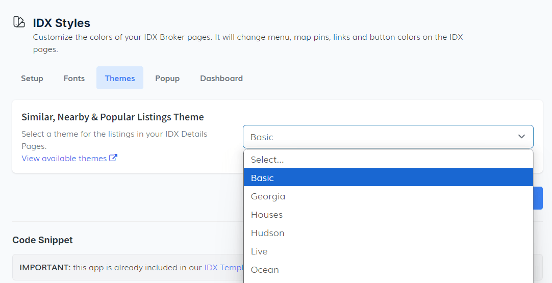
In the Theme tab, you can select the visual style for your IDX Details Pages. This section provides you with various theme options for similar, nearby, and popular listings.
- The dropdown menu offers several theme templates, such as Basic, Georgia, Houses, among others. Simply choose the one that aligns best with your website's design.
- Similar, Nearby & Popular Listings Theme: Choose a theme to determine how similar, nearby, and popular listings will be displayed on your IDX Details Pages, improving the visual appeal and usability of the page.
To preview these themes, click on the View available themes link for a live demo before finalizing your selection.
-
Pop-up Settings
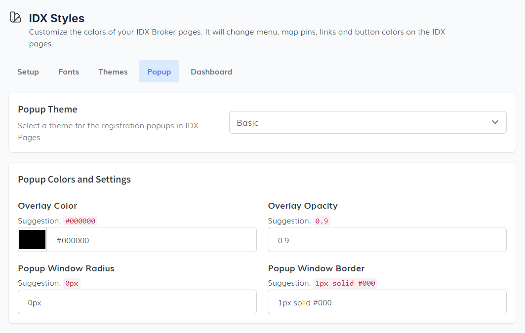
In the Pop-up tab, you can customize the design and functionality of registration pop-ups on your IDX pages.
View available themes for a live demo of the pop-up themes before making your selection.
- Theme Selection: A dropdown menu allows you to select a theme for the pop-ups. By default, you will find a Basic theme, but additional themes, such as the Two Steps form, are available depending on your design needs. The Two Steps theme includes special settings like adding a password field, which automatically fills with the phone number (based on a client request to mimic the BoomTown feature)
- Pop-up Color and Settings: After choosing a theme, you can customize the color of the pop-ups and adjust the settings to match the overall style of your website. These customization options are flexible, giving you control over how pop-ups appear on your IDX pages.
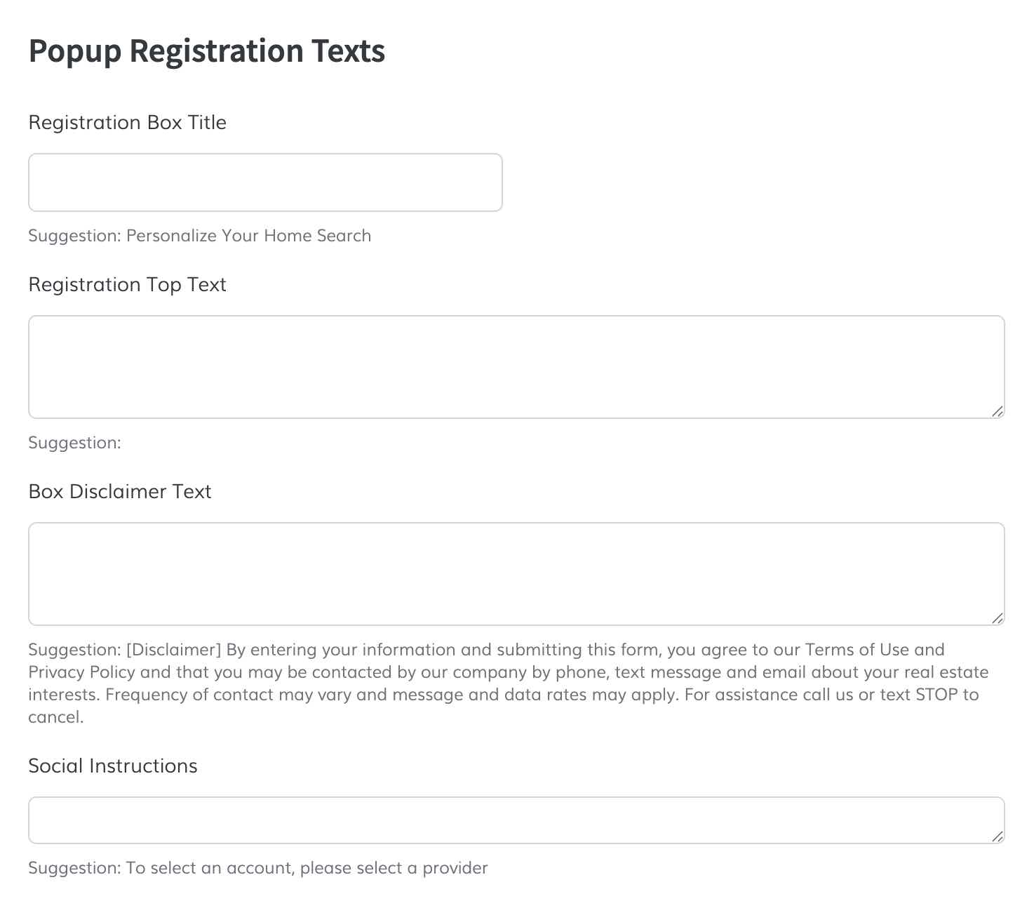
- Popup Registration Texts: You can customize the texts that appear on the registration pop-up, such as:
- Registration Box Title: This is the main heading that appears at the top of the registration pop-up, guiding users on what action to take.
- Registration Top Text: This text appears below the title and provides additional information or instructions to encourage users to complete the registration process.
- Box Disclaimer Text: This is a smaller text that typically appears at the bottom of the pop-up, providing legal disclaimers or additional information about data usage and privacy policies.
- Social Instructions: If you have social media login options enabled, this text will provide instructions or information about using those options for registration.

The configuration here is at the user's discretion, enabling full personalization of the pop-up registration forms.
The Two Steps Form theme offers a unique registration experience by breaking the registration process into two steps. To fully utilize this theme, follow these additional steps to ensure that the pop-up functions as intended and provides a seamless user experience on your IDX pages.
- Step 1: Go to IDX Styles and select the Two Steps theme from the Theme Selection dropdown. You can preview these popups on IDX pages when you save a search or property, or when an agent sets a view limit in the IDX settings.
- Step 2: To fully utilize the Two Steps theme, go to IDX Broker Registration Preferences and add a password field to the registration form. This password field is auto-filled with the phone number, mimicking the functionality of BoomTown.
- Step 3: (Optional) if you want to edit the texts on the popup, you can use the fields provided in the Pop-up Registration Texts section to customize the content that appears on the pop-up, ensuring that it aligns with your branding and provides clear instructions to users during the registration process. The Two Steps theme includes 3 extra text fields that allow you to customize the content for each step of the registration process.

- Placement: Displays at the bottom of the pop-up (exact location may vary by theme).
- Formatting: Supports basic HTML (links,
<strong>,<em>, line breaks). Scripts are not allowed. - Include: purpose of contact, SMS disclosure if applicable (STOP/HELP and standard message/data rates), and links to Terms of Use and Privacy Policy.

-
Dashboard Customization
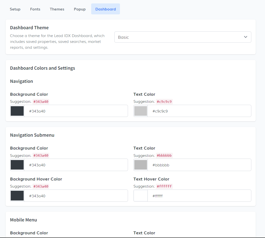
In the Dashboard tab, you can customize the visual theme for the Lead IDX Dashboard, which includes sections such as Saved Properties, Saved Searches, Market Reports, and general settings.
- Theme Selection: A dropdown menu is available to select the desired theme for the Lead IDX Dashboard. The default option is the Basic theme, but you can choose other themes depending on what best fits your site's look.
- Dashboard Color & Settings: Here, you can further personalize the dashboard with options for background color, text hover color, text color, and more. The flexibility allows users to fully tailor the dashboard's appearance to their preferences.
- Navigation Submenu & Mobile Menu: In this section, you can adjust the appearance of the dashboard's navigation submenu and mobile menu, again allowing for the selection of colors and styles to match the overall theme of your website.
With these settings, users can create a cohesive and visually appealing dashboard that enhances the experience for leads interacting with their saved searches and market reports.
