-
Access the Platform
Log in to your IDXAddons account
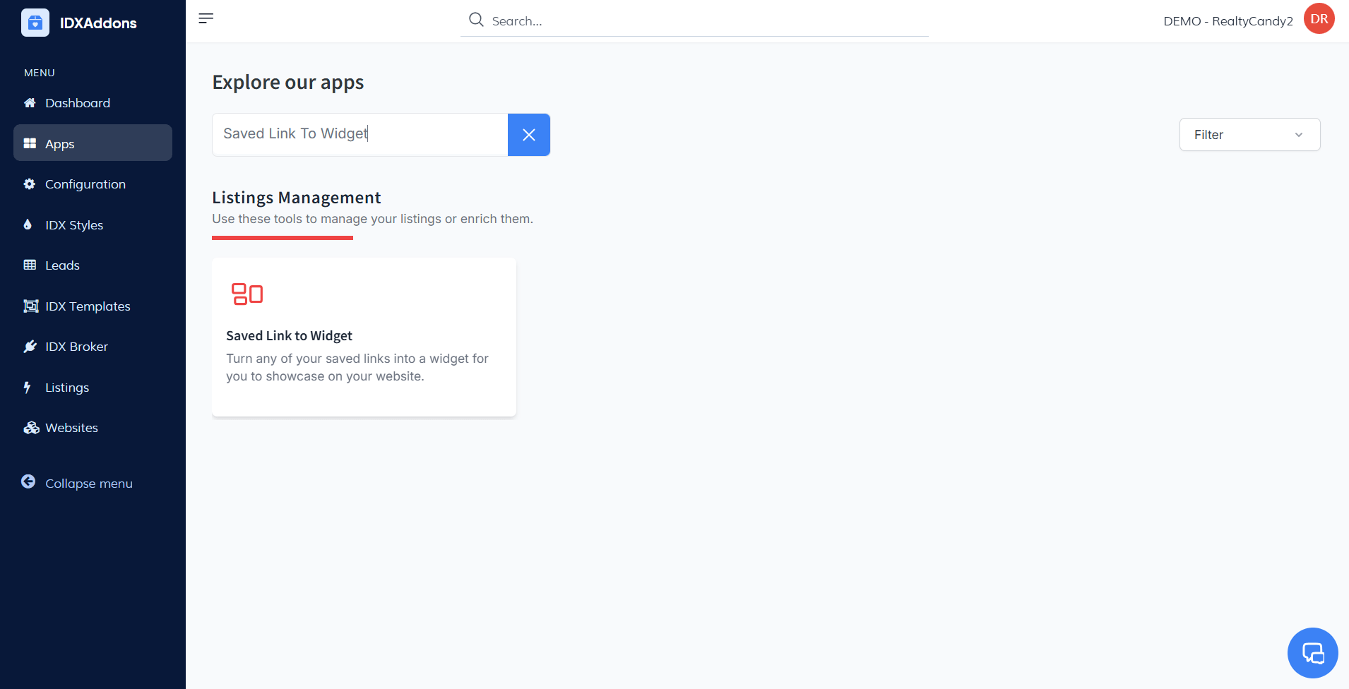
In the dashboard, select the Saved Link To Widget app.
-
Setup Tab
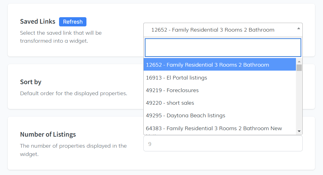
This is the first section in the Setup Tab, where you need to select the saved link you want to transform into a widget. Here's how it works:
-
Select a Saved Link
- Click on the dropdown menu to view all the saved links available in your IDX Broker account.
- These saved links are the ones you've created in your IDX Broker account. If you need to access them directly, you can find them here: IDX Broker Saved Links.
-
Choose the Desired Link
- From the dropdown, select the saved link you want to use for your widget.
This process ensures that the widget will be based on a saved link you’ve already set up, making it easy to display the desired properties in your widget.
 Sort By
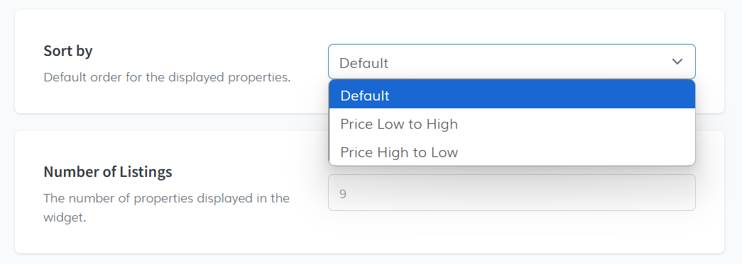
Choose the default sorting order for the properties displayed in the widget. You have three options:
- Default: The regular sorting order used by the system.
- Price Low To High
- Price High To Low
 Number of Listings
Select the number of properties to display in the widget. For example, you can input 9.
 Open In New Tab
Toggle this option if you want listings to open in a new tab when clicked by a user.
 Image Width
Set the width of the listing images. The default value is 240, but you can change it to fit your needs.
 Image Height
Choose the height for the images. The default value is 180.
 Use Original Images
Toggle this on to use original images for the listings. This option is useful if you want to display high-quality images in the widget, however it may slow down the loading time.
 Show "View All Results" Button
Toggle this to display a button that links to the full results page. This is useful if you want to direct users to the IDX Broker results page.
 Agent
Agent
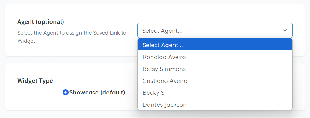
Optional: Select an agent to assign the Saved Link to the widget. This opens a dropdown with agents you’ve previously created.
 Widget Type
This is how you want the widget to display listings on your website for desktop users. The default option is Showcase, which displays listings in a grid, while Carousel shows them in a horizontal scroll. Choose the format that best suits your needs.
 Widget Type - Mobile
This is how you want the widget to display listings on your website for mobile users. The default option is Showcase, which displays listings in a grid, while Carousel shows them in a horizontal scroll. This option only works if you have selected a theme.
 Copy the Code
Once you’ve made your selections, a widget will be created. Click on the Copy Code button to copy the widget code to your clipboard.

-
Select a Saved Link
-
Style Tab
In the Style tab, you can customize the widget's appearance to align with your website’s design. This section allows you to choose a theme, adjust color schemes, and add advanced customizations through CSS or JavaScript. Here's how you can configure it:
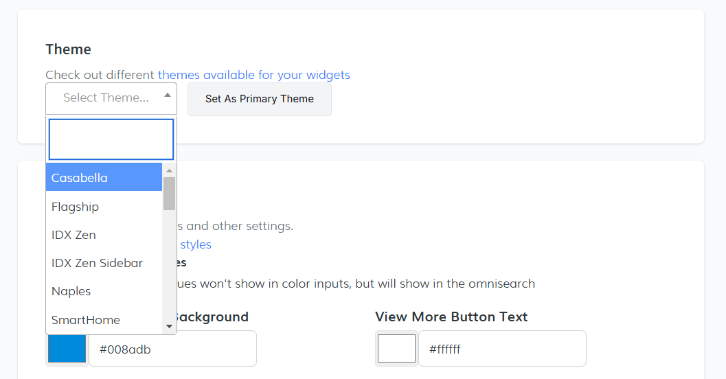
ThemeSelect the theme that best suits your needs and click the Set As Primary Theme button to apply it as your main theme.
 Color Scheme
Customize the colors for various elements in your widget. Below are some of the adjustable options:
- View More Button Background: #008adb
- View More Button Text: #ffffff
- View More Button Background on Hover: #0065a0
- View More Button Text on Hover: #ffffff
- Carousel Arrows Background: #008adb
- Carousel Arrows Text: #ffffff
- Carousel Arrows Background on Hover: #0065a0
- Carousel Arrows Text on Hover: #ffffff
- Badge Background: #008adb
- Badge Text: #ffffff
- Widget Background: #008adb
- Widget Text: #ffffff
- Featured Text Color: #008adb
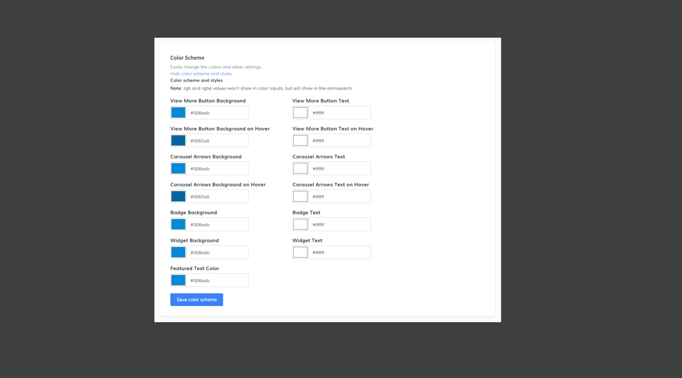
Once you have selected your preferred colors, click Save Color Scheme to apply the changes.
Show Advanced SettingsFor further customization, reveal additional settings by clicking this option:
- Custom CSS Code: Add your own CSS to adjust the widget’s appearance. Note that "style" tags are not required.
- Custom JS: Add JavaScript rules to modify the widget's functionality. "script" tags are not required.
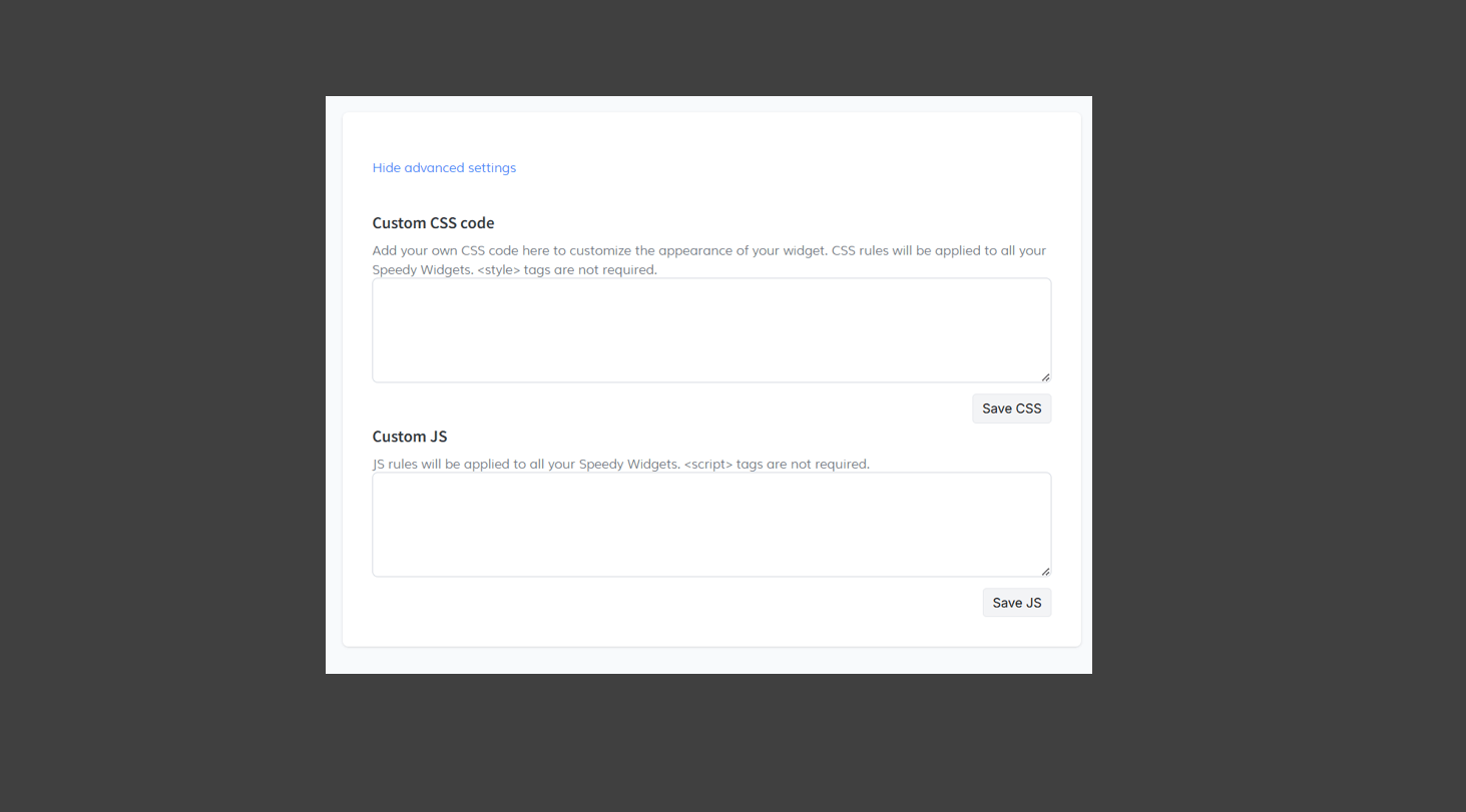
After entering your CSS or JS, ensure you click the respective save buttons to apply the updates.