-
Access the Platform
Log in to your IDXAddons platform account
In the dashboard, select the search tool app.
-
Setup Tab
In the Setup tab, you can modify the placeholder text that appears in the search bar. This customizable text helps users understand what to input, such as Address, City, or Zip Code, making searches more intuitive.
 City List
Choose the custom city list for the search bar from the dropdown menu. The available options will be based on the lists you have created in the IDX Broker account. Manage your city lists.
This selection determines which cities will be available in the dropdown menu for users to select. Agent Selection
If you have an office account, you'll be able to select an agent from the list of available agents. This feature allows you to assign a specific agent to the search tool.
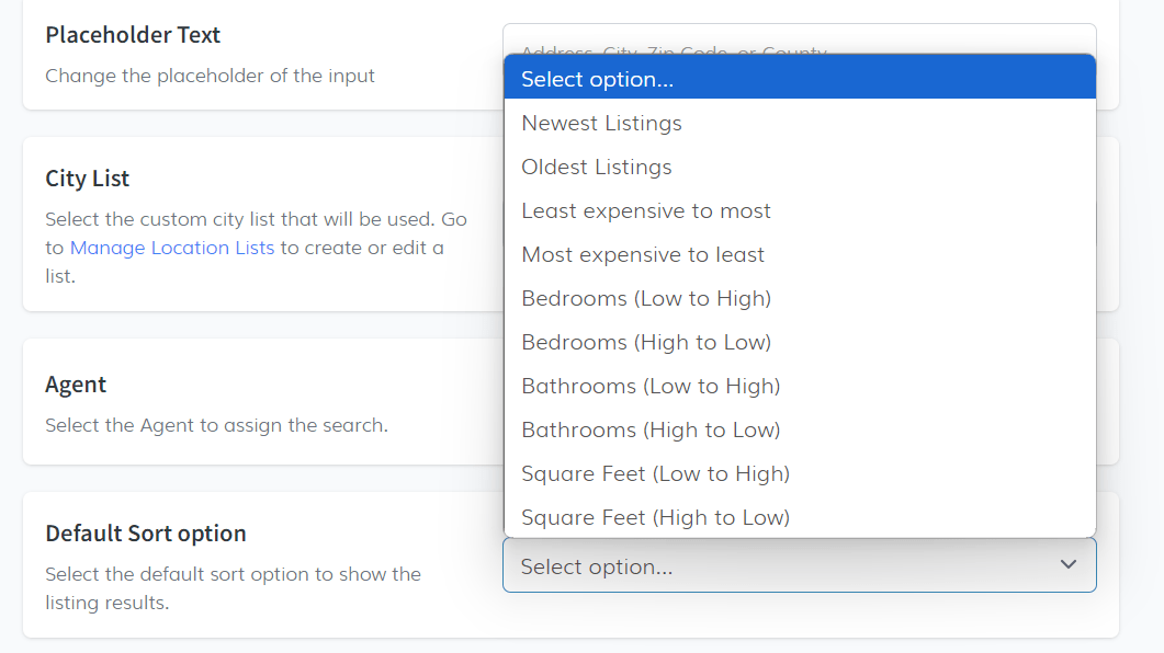
 Default Sort Option
Set the default sorting option for search results. You can choose from
- Newest Listings.
- Oldest Listings.
- Least Expensive to Most Expensive.
- Most Expensive to Least Expensive.
 Default Status Option
Select the default status for displaying listings. Available options are:
- Active.
- Pending.
- Active Under Contract.
 Show City, County, and Zipcode Labels
Use the toggle button to enable or disable labels for city, county, and zipcode in the autocomplete field, which helps users identify the type of information they are entering.
 Show State Abbreviations for Cities
This toggle is enabled by default to display state abbreviations for cities. You can disable this option if you prefer not to show abbreviations.
 Show Field Labels
The toggle for showing field labels is enabled by default, meaning that field labels appear above the fields. When disabled, fields will only display placeholder text.

-
Search Fields
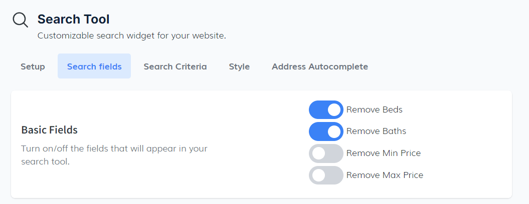
In the Search Fields tab, you can manage which fields will appear in your search tool by toggling them on or off. The available options include:
- Beds: Allows users to filter properties by the number of bedrooms.
- Baths: Allows users to filter properties by the number of bathrooms.
- Minimum Price and Maximum Price: Enables price range filtering for users.
 Property Type
When configuring the Property Type section, you can choose how this field will appear in your search tool:
- None: A regular search bar will be generated without property type options.
- Buy and Sell Tabs: Displays separate tabs for buying and selling properties.
- Dropdown: Displays the property type options in a dropdown menu.
 Open New Tab
Enabling this option will open the IDX results page in a new browser tab when the search tool is used.
 Sort By Dropdown
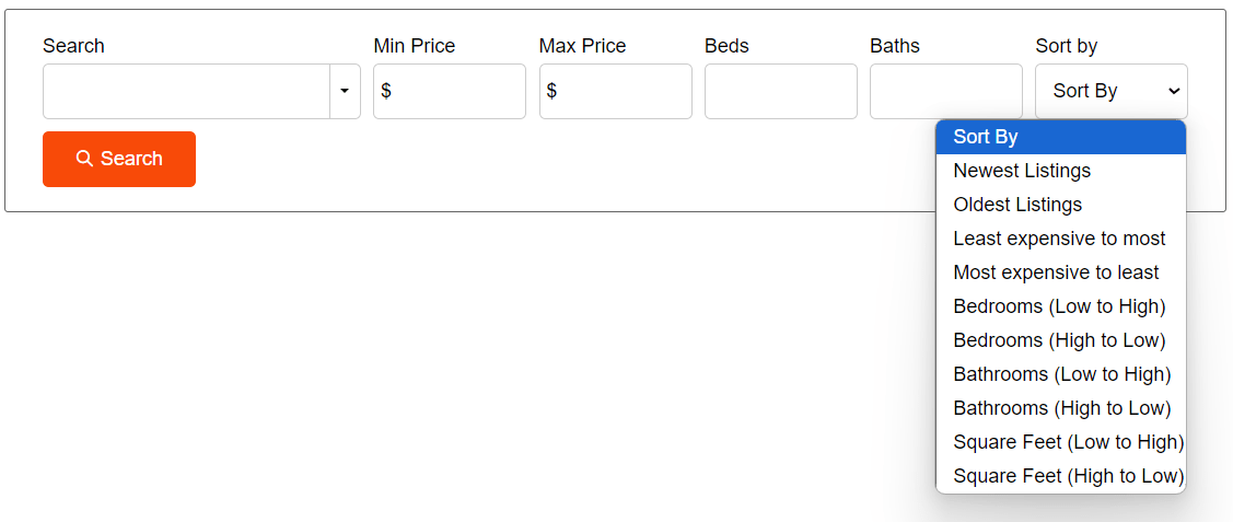
The Sort By feature allows users to organize search results according to specific criteria. You can toggle this option on, and a dropdown menu will appear with options such as:
- Newest Listings.
- Oldest Listings.
- Least Expensive To Most.

This example shows the sort by
 Show Status
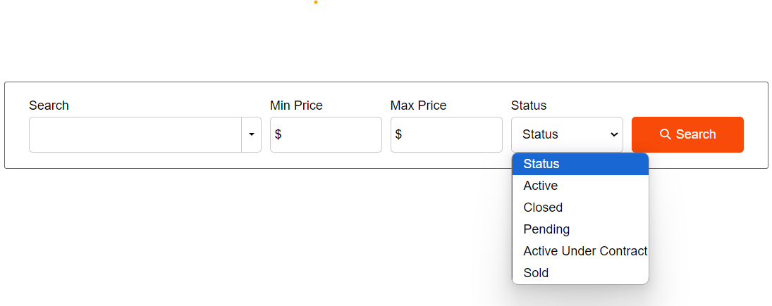
When activated, this toggle will display the status of each property (e.g., Active, Pending, Sold). You can select specific status types to include, such as:
- Active.
- Pending.
- Active Under Contract.
Add Sold Data Status: By enabling this toggle, the status of Sold/Closed listings will also be displayed.

This example show the status and the add sold data status:
 Show Advanced Search Link
When activated, a link to the IDX Broker's advanced search page will be displayed in the search tool.

Here is an example of what the advanced search link looks like
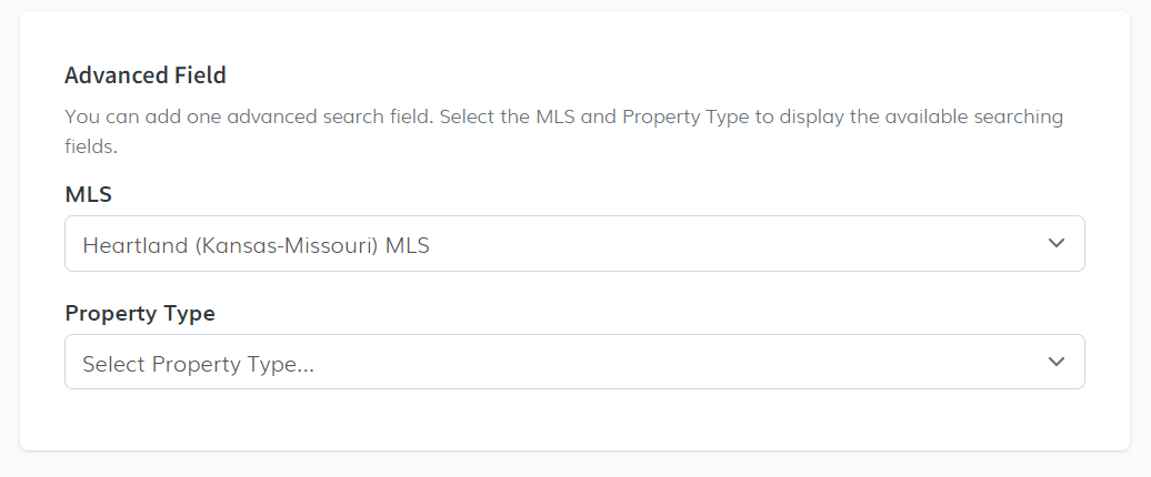
 Advanced Fields
You can add one advanced search field by selecting the MLS and Property Type to display the available searching fields.
- MLS.
- Property Type.
-
Search Criteria - Default Values
This section allows you to control whether the price, bed, and bath fields are shown as dropdown options in the search tool.
To start, you can turn on or off these dropdown fields using the Toggle button. When the toggle is on, the fields for price, beds, and baths will appear as dropdown menus, where users can select their options from preset values. If the toggle is off, these fields will not be shown in the search tool.
 Price Fields
Min Price:
- From: This is the lowest price option available in the dropdown. (Default Value: 0).
- To: This is the highest price option available. (Default Value: $1,000,000).
Max Price:
- From: This is the minimum value for the maximum price field. (Default Value: $1,000,000).
- To: This is the highest value for the maximum price field. (Default Value: $2,000,000).
Price Increase Interval:
- Sets the step between price options in the dropdown. For example, if set to $100,000, each option will increase by $100,000. (Default Value: $100,000).
Beds:
- From: This sets the lowest number of bedrooms users can select. (Default Value: 0).
- To: The highest number of bedrooms available. (Default Value: 10).
Baths:
- From: Sets the minimum number of bathrooms. (Default Value: 0).
- To: The maximum number of bathrooms users can select. (Default Value: 10).
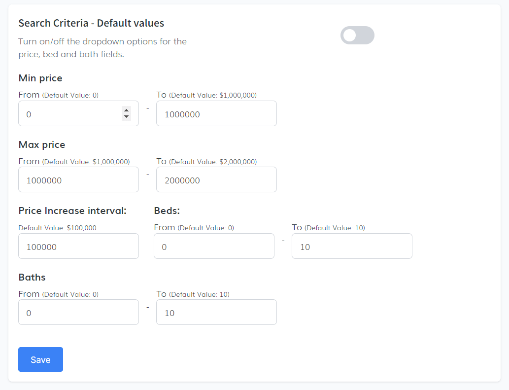
After entering the necessary information, make sure to click the Save button to apply your changes.
-
Style Tab
In this section, we will walk you through how to customize the appearance of your search tool in the Style tab. Follow these steps carefully to apply your preferred design:
Theme SectionFirst, you'll find the Theme section where you can select a theme for your custom search tool.
- Locate the dropdown under the "Theme" section.
- The available option for the theme is Basic. Select this from the dropdown.
 Custom Style Section
Here you can modify colors, borders, fonts, and other design elements for your search tool. The platform suggests default values, which you can modify as needed:

You will see a button called Show Me. Clicking this will display an example image showing how the search tool will look with the current settings.
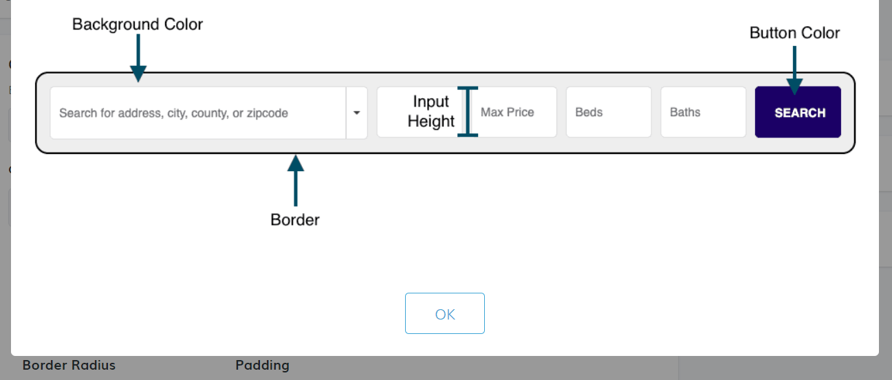 Color Scheme and Styles
In this part, you can configure the colors and styles of various components of the search tool. Suggested default values are provided by the platform:
Here are a few examples:
- Background Color: Suggestion: #ffffff.
- Border Size: Suggestion: 1px.
- Font Family: Suggestion: sans-serif.
- Button Color: Suggestion: #f84a08.
- Tabs Height: Suggestion: 60px.
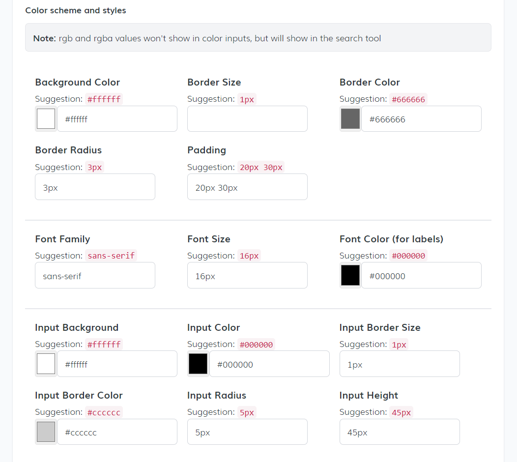
You can adjust each of these fields based on your preferences. Once you've made the necessary changes, click the Save button to apply your customizations.
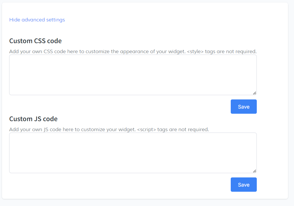
Advanced SettingsAt the bottom of the Style tab, you will find an option for Advanced Settings.
Click the Show advanced settings link. This will display additional customization fields
- Custom CSS Code: You can add your own CSS code here to further customize the appearance of your widget. style tags are not required.
- Custom JS Code: You can also add JavaScript code to customize the widget's behavior. script tags are not required.
-
Address Autocomplete Tab
In this final step of the tutorial, we will cover the Address Autocomplete settings, which help refine the results when users type in an address in the search tool.
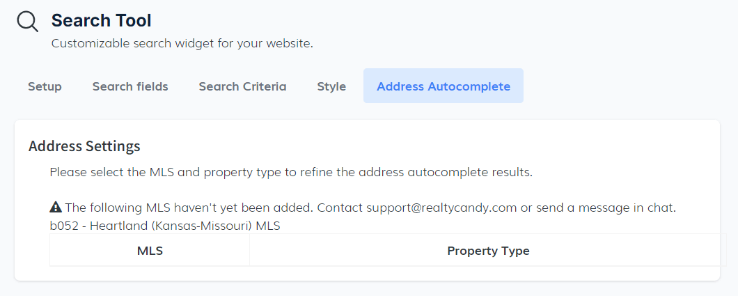
Address SettingsIn this section, you’ll be able to select the MLS and Property Type to ensure the address autocomplete feature provides accurate suggestions for your users.
- MLS and Property Type: Start by choosing the relevant MLS and property type from the dropdown menus. This will help filter the results and improve the precision of address suggestions.
 Code Snippet
After configuring the settings, the final step is to integrate your search tool into your website using the provided code snippet.
- Copy the Code: Once all changes have been made, click the Copy Code button. This will save the code to your clipboard automatically.
- Paste the Code: Now, paste the copied code in the section of your website where you want the search tool to appear.

This process is essential to make the customized search tool visible and functional on your site. Each tab within the tool also generates its own snippet, allowing for flexibility if you need to integrate sections individually.