Data Graph Widget
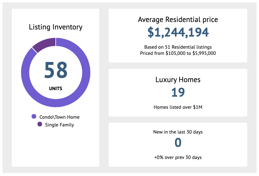
Display community information using IDX Broker Saved Links, showcasing the details of those communities in an easy-to-understand graph: average listing prices, amount of listings, and more can be displayed in this attractive widget!
Use this appGet IDXAddons Now
Unlock IDX Broker potential with IDXAddons. Enjoy our amazing & fully customizable widgets to make your website stunning.

Elevate Community Awareness with the Data Graph Widget
Welcome to the future of community information display with our innovative 'Data Graph' widget. This dynamic tool takes community insights to the next level by showcasing detailed data in an easy-to-understand graphical format.
Gone are the days of sifting through endless numbers; now you can visualize essential details such as average listing prices and the number of listings with unparalleled clarity.
This attractive widget not only enhances user engagement but also empowers them to make well-informed decisions when exploring different neighborhoods. With the 'Data Graph' widget, you're not just offering data – you're providing invaluable insights into the real estate landscape.

Customize Community Data
The Data Graph widget is a game-changer for those looking to tailor community information to their unique needs. It offers the flexibility to display a range of data, including average listing prices and the quantity of listings.
What sets this widget apart is its adaptability to various preferences. You can choose to highlight the data points that matter most to your users and present it in an engaging, graphical format.
Whether you're a real estate professional looking to empower your clients or a property seeker aiming to make informed decisions, the 'Data Graph' widget allows you to personalize your data, making it relevant and actionable.

Enhance User Experience and Tailor Insights
Incorporating the Data Graph widget into your real estate website offers a world of customization possibilities. This powerful tool not only transforms data into user-friendly graphs but also allows you to tailor your insights to match your unique needs.
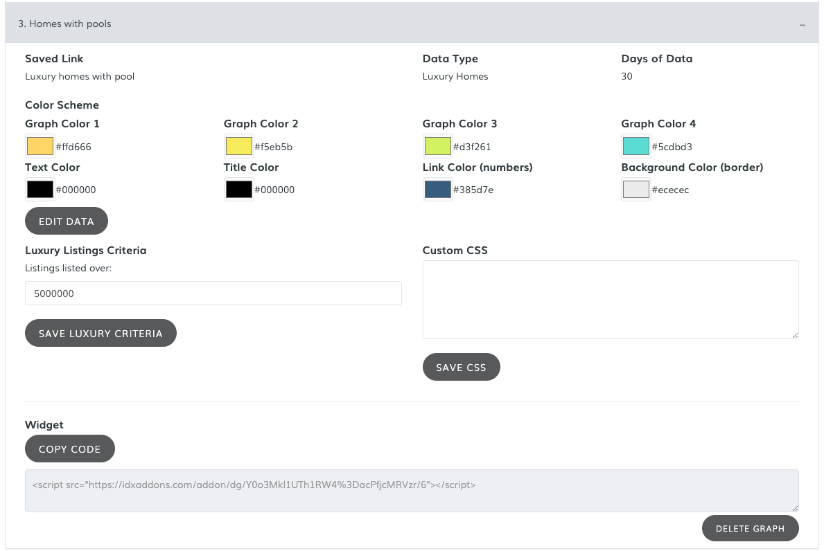
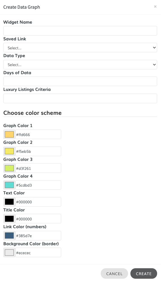
You have the freedom to select the color scheme that best suits your website's style, ensuring a seamless integration with your branding. Additionally, you can take it a step further by choosing to display luxury home data or sold information.
Furthermore, the widget gives you the flexibility to select the specific time frame for data retrieval, offering insights that are as current as you need them to be.
With the 'Data Graph' widget, you're in control of your insights, enabling you to provide your users with data that's not just informative but also precisely tailored to your preferences.
We have updated the Data Graph widget so that you can customize your graphs more. Check it out to see how easy it is!
Use this app