Data Graph Tutorial
-
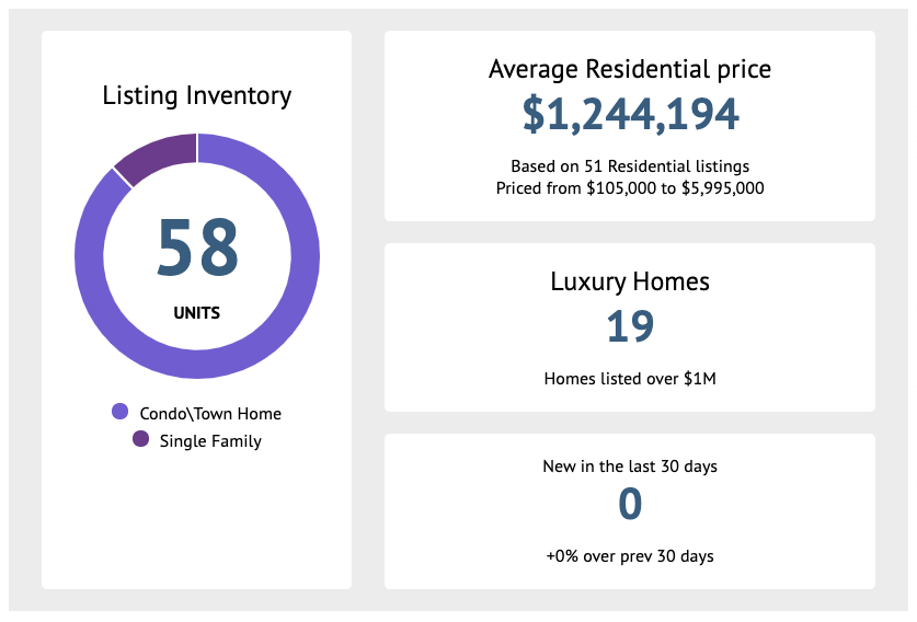
How does it look?
You can display a graph like this:
-
Click on the button Create new Data Graph.

-
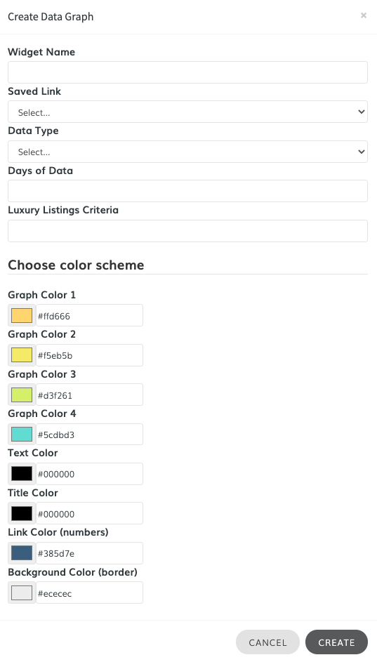
Fill the form
Fill out all of the fields of the following form:
-
Select the Saved Link
Select the Saved Link that will be used to generate the graph data.

-
Select the Data Type
Choose between Luxury Homes or Sold Data (only available in IDX Broker Platinum Accounts)

-
Select the Days of Data
The Days of data will represent the Days in Market or the Days Sold, depending on the Data Type previously selected.

-
Click on the color pallete to start assigning it with a color. The colors selected will be used in the doughnut graph. You can also enter the HEX value of the color in the input field (e.g. #ffdc66).
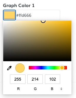
Once you're happy with your selection, click on "Create".
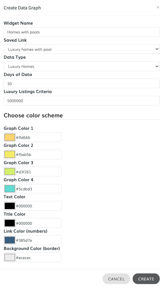
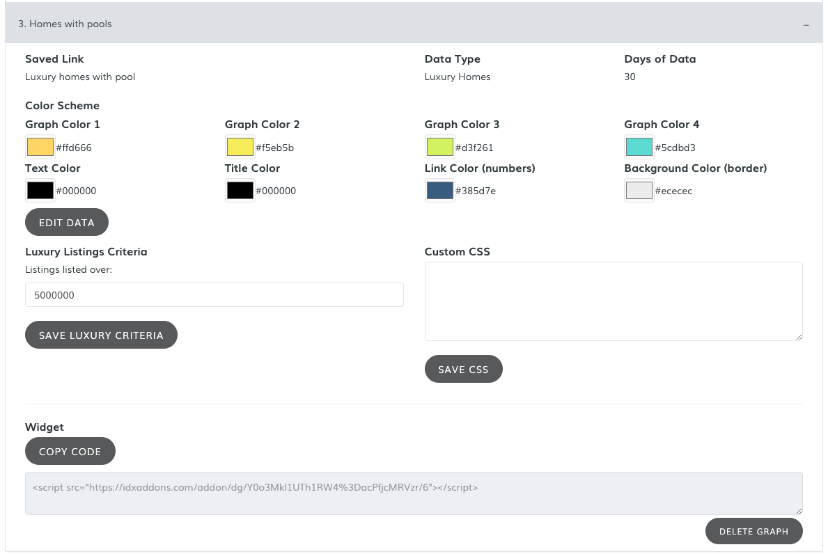
Your new graph will be displayed in the Setup tab.

To view the details, just click on the name of the graph.
-
Copy the New Code
Click on the Copy Code button and the script will be copied to your clipboard.

-
Paste the Code
You can now paste this code where you want it to go on your website.