Fallback Widget Tutorial
This add-on is used so that your clients are always looking at properties and never at blank space. You can generate many different fallback widgets for your site.
How to set it up:
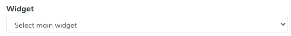
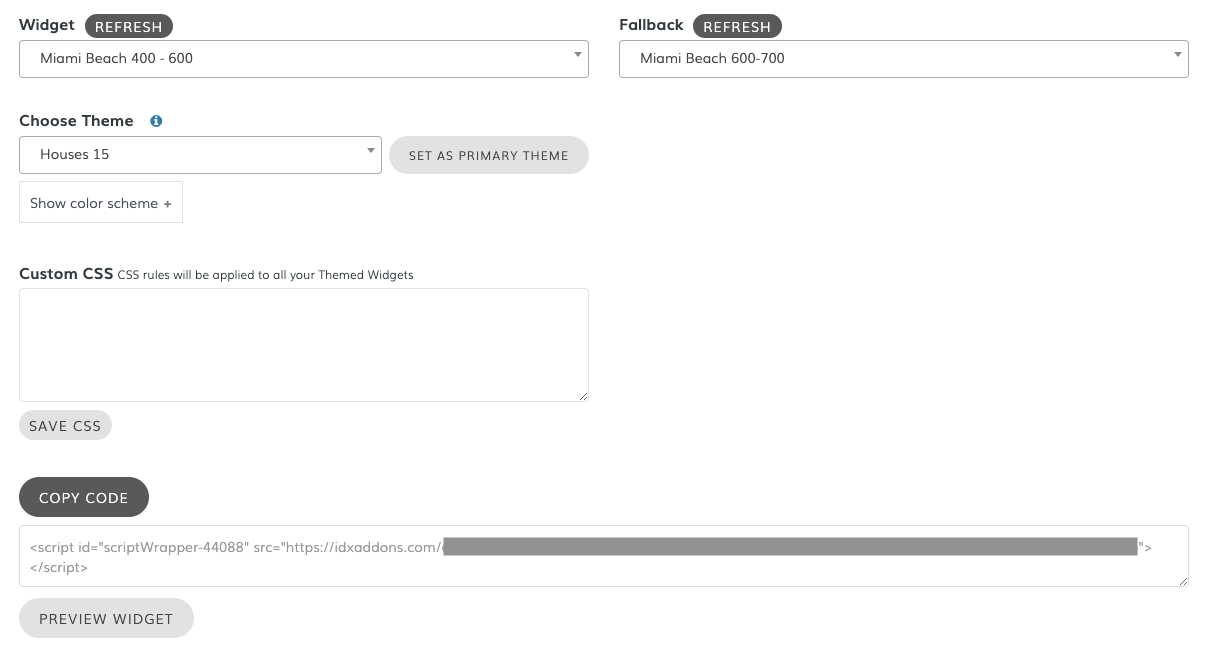
1. Choose the main widget
Select the main widget or section of your site.
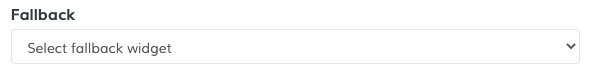
2. Choose the fallback widget
Select a fallback or backup widget to replace the main one.
This widget is activated automatically when there are no properties to show on the main widget that you selected.
3. Set a widget theme (optional)
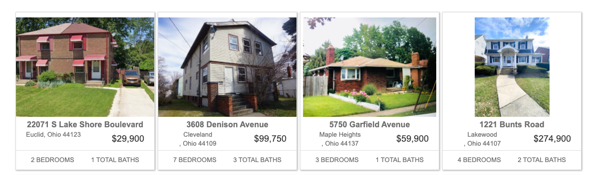
You can add a theme to your widget. You can showcase some examples here
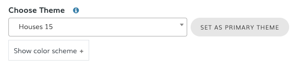
For this example, we will choose the "Houses 15" theme:
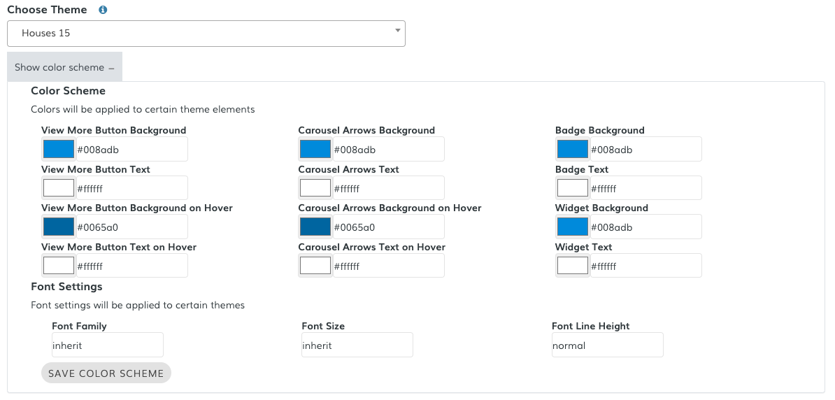
After selecting the theme, click on "Show color scheme" to display the available options. You can set the different colors, according to the selected theme. Notice that only some colors will be applied to certain elements, depending on the selected theme. Once you're happy with your selection, click on "Save Color Scheme".
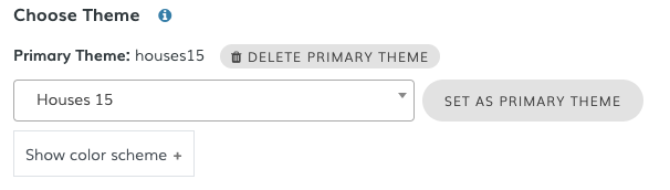
Set a primary theme
If you want to use only one theme (recommended), just select the theme and click on "Set As Primary Theme".
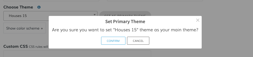
When you select the Primary Theme, you will see this message. You can always change the default theme later.
Note that changing the Default theme will not change the theme your website widgets are already using. This setting is used only for making it easy for you to find the theme you used before.
4. Copy the New Code
Once you've made your selection, click on the Copy Code button and it will be copied to your clipboard.
5. Paste the New Code
You can now paste the new code where you want the change to be made.